The Monthly Tiller
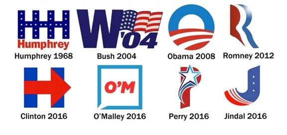
The Monthly Tiller is 3Seed’s take on all things creative. Since the presidential primaries are rapidly approaching, we decided that for the first installment, we would get our team of designers’ take on these presidential logos – both past and present. Here’s what they had to say.

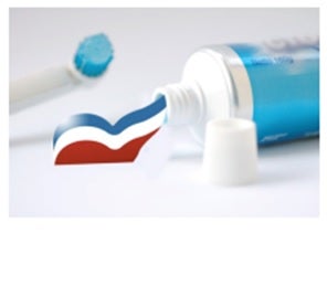
Mike Plunkett: Romney 2012 looks like it was literally squeezed out of a tube.

Megan Ewer: Clinton 2016: I get it, an arrow to signify the future… but really? You couldn’t come up with something a tad bit more creative? Its simple, but boring and overdone.
Kyle Smith: O’Malley 2016: I’m on the fence with this logo. I can appreciate the total outside the box approach of the play on a speech bubble, but I’m not sure that it’s successful. I don’t think people will take it seriously.
Kyle Desimone: Jindal 2016 I think this one makes the most sense. The outline clearly makes a “J.” I like how it is simple and get the point across.
Kyle Smith: Perry 2016: This is a pretty lackluster attempt at creating a more unique and different political logo. It looks more like a minor league baseball team logo and that P?? Quite possibly the worst font that could have been chosen to go with this design.
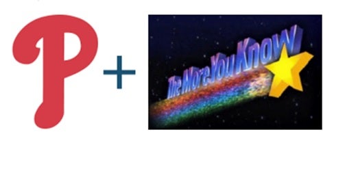
Mike Plunkett: Perry 2016 looks like a combination of two of my most favorites growing up.

Megan Ewer: Perry 2016: Is this guy a cheerleader?! I definitely won’t be cheering for his branding this election.
Kyle Desimone: O’Malley 2016 I don’t hate this one. I see the speech bubble made from the box. I like that the colors lighter and aren’t the usual reds and blues.
Megan Ewer: Jindal 2016: Playing with the form of the J provides much needed movement and fluidity to this logo. Not the best, but definitely not the worst.
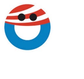
Mike Plunkett: Obama 2008 looks like the grinning face with wide eyes emoji 😀 Maybe the logo was celebrating because it knew Obama would be elected.
