Rebranding Part II: The Look- More Than Meets the Eye

Here’s how :
1) A Memorable Logo
It’s the age old question, what came first: the logo or the brand? It is even more difficult to say because brands and logos are constantly being reevaluated and updated. But, the answer should be that the brand came first and the logo that follows needs to match, complement, and enhance the brand.
A lot goes into creating a custom logo for your company. The look of your brand is often your brand’s first impression. If you want to change the way people see your brand, you’re going to want to catch their attention. A logo is the part of your visual identity that will get the most exposure so go for a simple look that evokes a strong emotional response. Like this one:
2) An Attractive Color Palette
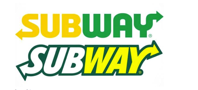
There is powerful psychology behind color. Different colors convey certain emotions and specific industries gravitate towards specific colors. There are times to follow these rules and times to break them. You need to have a clear understanding of your brand (think last week’s message) and of your industry in order to know when to follow the rules and when to break them. The key is to toe the line between exciting and on brand. Subway updated their logo (top) with a simpler take on their well recognized logo. Notice it’s only two colors, but those colors evoke the familiar comfort of the classic brand, with the green bringing forward feelings of fresh food, and yellow reminding consumers of the sun.

3) Strong Typography
Some logos are most clearly recognized by their font. That’s why it is important that we stress the importance of the right type. Several fonts may be utilized if they work harmoniously together; however, a single, powerful font should lead your brand.

4) Supporting Graphics
One of the modern challenges of creating, or recreating, your brand’s visual identity are the supporting graphics, such as icons and photography, that are crucial to brand identity in 2017. There is no brand that does a better job of creating a cohesive visual brand that matches their messaging than Google itself. To understand why this is important, look no further than the Google Visual Assets Guidelines, which does a great job of explaining the “why” behind their visual assets, which may help you shape your own.
Now, Pull Together the Look
Once you have your messaging down, it is important to weave your brand’s mission and beliefs through your visual identity. Stay tuned for the last installment of our three part series, where we’ll focus on the medium. Whether it’s social media, print advertising, or your website, you’ll want people to easily recognize your brand.