Branding for the Brain
Brand development works because we subconsciously assign meaning to everything. Through our brand, we are sending out messages to the people who in turn interpret those messages in their own unique way. They assign meaning to every word, image, and tone.
Consider your logo. Your logo nonverbally communicates with the public every time they see it. It’s a sort of brain game. Since we attach meaning to everything, designers have to strategically play the game. They have to understand the psychology that goes on inside your cranium to make your logo great.
There are three main aspects of a logo that they must consider:
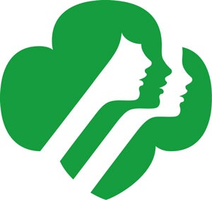
Shape – Curved shapes like circles and ovals can signify community. Shapes with curves also tend to be more feminine. Triangles and squares and like shapes provide balance and practicality. You can also get creative with your shapes. The Gestalt theory suggests that the human brain will fill in the missing pieces, or negative space, of an image, giving you room to get creative with your logo. For example, the Girl Scout logo.

Font – Font is one of the most important aspects of your logo as it gives your brand personality. Font can essentially make or break your logo. There are four major types of fonts: serif, sans serif, script and modern. Each one of these fonts as its own psychology behind it. Serif fonts are the most common types of fonts because they are easy to read. Serif fonts suggest reliability, respect and comfort. Sans suggests stability like the straight edge shapes, as well as futuristic and objective. Modern font is strong, chic and elegant. Display fonts are the most fun and unique out of all of the font types. Disney uses a display font that is really individual to them and sets them apart from all other brands.
Color – Color carries the most weight psychologically, as it effects the tone and emotions one has when looking at your logo. What do the brands Geico, Pampers and WebMD have in common? They are all trustworthy and dependable. They also use blue in their logos. Blue signified loyalty, trust and dependability. Brands like Wholefoods and Starbucks use green in their logos because it represents growth and harmony. Victoria’s Secret uses pink because pink denotes femininity and love. Red implies boldness, passion and love as seen in Coca-Cola and YouTube logos.
People subconsciously assign meaning to the image that you present. When you are thinking about your brand, and certainly your logo design, think about how your brain responds to the brand.

