Why Retiring a Memorable Part of Our Brand Was as Important as Creating It
Last week, we launched a social campaign to tease our new business cards. Our campaign may have led you to believe a member of our team was retiring. That’s exactly what we were trying to accomplish, because to us, it isn’t far from the truth. If you need a refresher or missed the buzz, check out our Facebook page to take in the full, week-long campaign, and to follow what our fruits and veggies are doing in retirement.
The concept of our fruits and veggies have been with us for almost ten years, and they served as an awesome ice-breaker or conversation piece when we first started 3Seed Marketing. We designed our brand in a way that our visual identity would naturally lead to the narrative of our brand story.
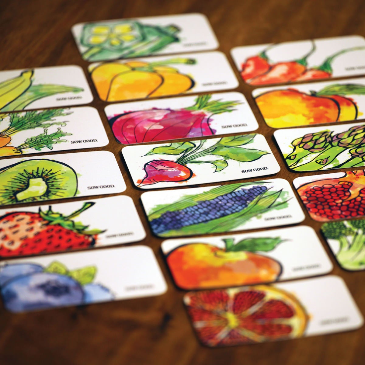
However, as our brand has grown, it became apparent that we relied less on this visual identity leading the narrative and more on the vast portfolio of work we’ve built along with our strong client partnerships.
New Decade, New Us
3Seed Marketing is in its 10th year of business, and so it felt like a logical time for a bold, new look.
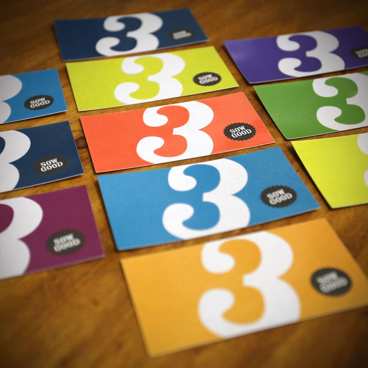
“We decided to retire the fruits and veggies from our business cards because we wanted a cleaner, fresher look,” commented Julie Moyer, one member of the managing partner trifecta of 3Seed, and the creative director behind the new look. “I still love and believe in a bold, memorable card, but now we do it through the use of colors, spot UV, and our 3 logo.”
The different colors are also a nod to the way Julie, and 3Seed’s additional two managing partners John Mulder and Andrea Luhman Guarino, do business: collaboratively. That’s why each member of our team was able to pick from a palette of colors to customize their own business cards.
“We’re all on the same team, but not everyone is the same,” said Julie. “Each member of our team has their own personality, quirks, and strengths, and we wanted that to shine through in our updated look.”
Building on Brand Philosophy
Our clients turn to us because they trust what we do and so it’s even more critical that we practice what we preach.
One of the tenants of our brand philosophy is to allow concepts time to grow, to not change too rapidly or too often. We use the example of not digging up a seed right away just because you don’t see a sprout. Another example we give is Gritty.
But, just as we preach that you need to stick with ideas in order for them to stick with your audience, we also believe it is important to keep current.
“We feel that this new look still evokes our identity and our confidence. We’ve been strategic about how we could transition the 3 logo into a standalone brand identifier and it feels great to finally be in that place.”
The Big 3
From the start, we wanted to get to a point where we could strip back the fruits and vegetables from our brand and allow the 3 to stand alone. To us at 3Seed, our 3 is similar to a mascot, with a personality that translates mostly through social media posts, but is also plastered around our office.
It’s sow exciting to finally be to the place where our 3 can stand alone, but it was a slow process.
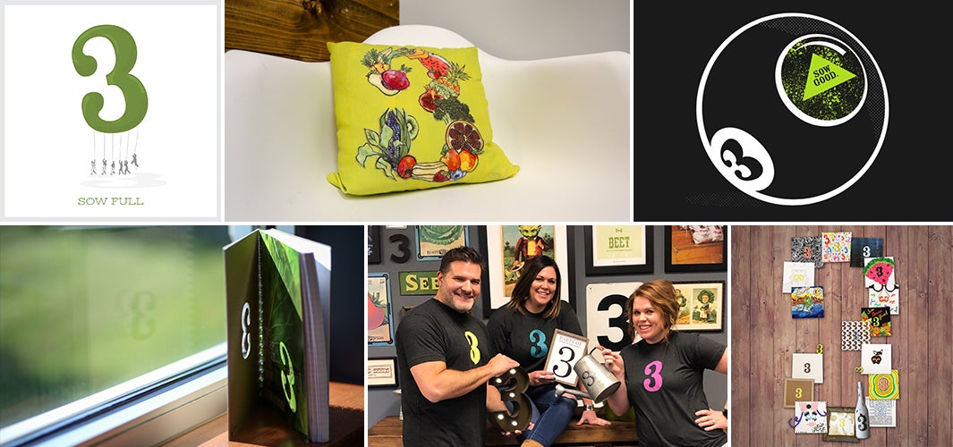
“We built up to this moment from day one by using our 3 icon alone on t-shirts and promotional materials such as our notebooks,” said Julie outlining her strategy. “Now, it’s such a recognizable brand identifier that people will send us pictures of 3’s they see out in the wild. That was a clue that we were ready to take the plunge.”
Do you feel as though your brand is getting stale and you’re not sure it’s time for a change? Wonder if you’re creating enough of a buzz on social media (hint: probably not!)? Or, maybe you just want someone to talk to, about marketing that is. We’re here to help. Contact us to start to sow good!